Hotel Sign: Exterior, Lobby and Door Brand Identity
Hotel sign guide covering room numbers, directionals, and ADA tactile plates in durable brass, acrylic, or metal for lobbies and corridors, MOQ 50, sourcing.
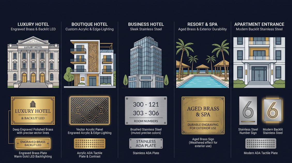
Hotel sign is the identity hardware of a hospitality property, spanning the exterior monument and blade signs that name the building from the street, the lobby directory and reception markers that orient the arriving guest, and the guest-room door plates and suite identifiers that carry the brand to the private threshold. A coherent hotel sign program combines visible brand messages for sighted guests with optional tactile and braille elements for accessibility, brand-matched materials and finishes that signal the property's tier, and a consistent layout logic that repeats from the facade to the furthest wing so a returning guest learns the visual language once and applies it everywhere. Unlike a single printed poster, a hotel sign must survive constant guest contact, housekeeping cart bumps, luggage scrapes, weather on the exterior and daily cleaning without messages fading, edges lifting or finishes scratching, which is why the components are produced by laser engraving into two-tone acrylic, routing into solid brass or aluminum, building into LED-illuminated acrylic, or fabricating into exterior-grade metal and composite. Modern hotel sign serves three masters at once: brand expression for the operator, wayfinding for the guest, and accessibility and life-safety compliance for the regulator, and the best programs satisfy all three across every component without one undermining the others.
Hospitality procurement teams specify hotel sign across boutique hotels, resort complexes, extended-stay properties, serviced apartments and budget chains, and the diversity of those venues means one material and one finish cannot serve them all, because a luxury resort wants a bronze monument and a backlit onyx-look acrylic that a budget chain would never justify, while both still need a name a guest can read from the curb. The property name on hotel sign is the single most-photographed element of a stay, because it is how guests confirm they have arrived, how rideshare drivers find the curb, and how a blind guest confirms the lobby with a fingertip at the accessible entrance, so its legibility and durability are non-negotiable. This guide examines the sign types, the materials from acrylic through brass and LED, the accessibility overlay, the mounting geometry, brand and lighting customization, cost and MOQ structure, manufacturer selection, common failures and the technology roadmap for hotel sign over the next five years as smart-property integration expands.
What Is A Hotel Sign And Why It Carries The Brand
Hotel sign is the marker that tells a guest which property they are at and where they are within it, and it carries the brand more heavily than almost any other object in the building because the guest reads the name at the exact moment of arrival, the emotional peak of check-in, so the material, finish and illumination of that sign become part of the perceived quality of the stay. A standard hotel sign presents the property name or room identifier in a clear type style, often paired with a brand logo and a small tactile and braille line for accessibility, all arranged so the name dominates and the supporting elements stay subordinate to the brand hierarchy. The name on hotel sign is the element that works at distance from the curb, which is why the type is usually a clean geometric or custom brand style with generous stroke and often a contrasting inlay or backlight so it reads from meters away, and why the finish is chosen to catch the daylight or corridor sconce rather than to disappear into the wall. The tactile text and braille on hotel sign exist to satisfy accessibility law in public accommodations, while the visible name exists to satisfy the guest's need to find the property, and a good program serves both without the compliant elements looking like an afterthought bolted on.
The durability framing for hotel sign is that its components live in the highest-contact and most-exposed signage environment in hospitality, because the exterior faces weather while the interior faces every guest touch, every housekeeping cart bump and every luggage trolley scrape, so a program that looks beautiful on install day but delaminates after months of alcohol wipes and weather becomes a recurring replacement cost and a brand blemish. A hotel sign component made from printed vinyl on foam will show edge lift within weeks of cleaning and will scratch as the first suitcase drags past, whereas an engraved acrylic or routed brass sign presents a monolithic face with the identifier in the material core, so the digit survives thousands of guest cycles and the exterior metal survives seasons. The name on engraved hotel sign is revealed by removing the cap layer of a two-tone sheet or routing the metal, which means the identifier cannot peel or fade because it is the substrate itself, not an applied film, and this physical integration is why compliant high-traffic and outdoor venues specify engraved or metal rather than printed signs. When a property buys hotel sign, the question is not only whether the name looks right on day one but whether it will still read correctly after years of real guest traffic and weather, and the answer decides the total cost of ownership more than the headline price does.
| Component | Function | Brand Role |
|---|---|---|
| Exterior monument | Property name | First impression |
| Blade sign | Street visibility | Arrival cue |
| Lobby directory | Property overview | Wayfinding hub |
| Door plate | Identify room | Primary cue |
| Accessible marker | Compliant entrance | ADA required |
Types Of Hotel Sign From Exterior To Door
Hotel sign comes in a family of types that together name and orient the property, and the principal members are the exterior monument, the projecting blade sign, the lobby directory, the reception and amenity markers, and the guest-room door plates and suite identifiers. An exterior hotel sign monument sits at the property line or above the entrance and carries the property name in large durable letters, serving the arriving guest and the rideshare driver who need to confirm the curb from the street, and it must be weather-rated and often illuminated for night arrival. A blade hotel sign projects perpendicular from the facade to catch the eye of a pedestrian moving along the sidewalk, serving wayfinding from the thoroughfare, and it must be engineered for wind load and secure mounting to the building structure. A lobby hotel sign directory lists wings, floors and amenities in one panel, serving the guest who enters and needs to know where to go, and it sets the type and color logic that every interior sign repeats.
The reception hotel sign marks the front desk and key amenities such as concierge, lifts and restaurant, serving the guest at the decision points inside the lobby, and the amenity markers extend that logic to the pool, spa, gym and business center. A guest-room hotel sign door plate carries the room number and sometimes the suite name at the private threshold, serving the guest at the emotional peak of arrival, and it is where the brand meets the individual stay. For large venues the complete hotel sign program layers the monument, the blade, the directory, the reception markers and the door plates into one system so a first-time guest moves from curb to room without asking, and the consistency of that system determines whether the hotel sign reads as institutional competence or as ad-hoc clutter. The type selection for any property starts from its arrival pattern, because specifying a monument where the entrance is hidden from the street, or omitting the blade where pedestrians approach along a sidewalk, is a wayfinding gap a guest will feel even if they cannot name it.
| Type | Placement | Function |
|---|---|---|
| Monument | Property line or entrance | Name from street |
| Blade | Facade projection | Sidewalk visibility |
| Directory | Lobby wall | Overview and routing |
| Reception marker | Front desk | Decision point |
| Door plate | Room threshold | Private identification |
Materials For Hotel Sign From Acrylic To Brass
Hotel sign components are manufactured from a range of substrates that balance legibility, illumination potential, tactile quality, weather resistance and impact resistance, with the dominant families being cast acrylic with laser-engraved through-color core, solid brass with routed and infilled numerals, anodized aluminum with enamel infill, LED-illuminated acrylic, and exterior-grade metal and composite for outdoor use. Cast acrylic hotel sign is the volume workhorse because the material is supplied in two-tone sheet where a colored cap layer sits over a contrasting core, so a laser or rotary engraver removes the cap to reveal the second color as permanent raised or recessed identifiers that cannot delaminate under wiping or scraping. Solid brass hotel sign delivers the premium hospitality look, with letters routed then infilled with a wear-resistant enamel or left as bare brushed metal, and it signals luxury tiers where the property wants the entrance hardware and the name to read as one crafted ensemble. Anodized aluminum hotel sign gives a lighter, modern alternative to brass with the same routing-and-infill durability, suited to contemporary and boutique properties, and LED acrylic hotel sign embeds a diffused light source behind or around the identifier so it glows softly, a signature of upscale and design-led hotels.
The illumination question decides material for many properties, because only acrylic and certain resin systems diffuse LED evenly without hot spots, whereas metal identifiers require a separate halo or under-glow fixture to achieve the backlit look, which changes both the fabrication and the mounting, and the exterior needs its own weather-rated lighting family. A hotel sign LED component must manage heat and wiring so the light source lasts as long as the sign face, and the best designs run the cable through a concealed channel to a low-voltage driver mounted behind the wall, avoiding the exposed wire that cheap backlit signs suffer. Brass and aluminum hotel sign win on impact resistance and patina potential, because a metal identifier shrugs off a luggage scrape that would gouge acrylic, and brass develops a living finish many luxury operators consider part of the brand rather than a defect, while exterior metal must be grade-rated for corrosion in coastal or cold-climate sites. The material decision for hotel sign should start from the property tier, the corridor lighting and the indoor-outdoor split, because a glow name in a dark resort lobby solves a real wayfinding problem, while the same glow on a bright budget facade is wasted spend a simple engraved acrylic would deliver more cheaply, and the exterior demands its own rated family.
| Material | Look | Best Use |
|---|---|---|
| Two-tone acrylic | Clean, versatile | Indoor budget to mid |
| Solid brass | Luxury, warm | Indoor upscale |
| Anodized aluminum | Modern, light | Indoor boutique |
| LED acrylic | Glowing, signature | Indoor design-led |
| Exterior metal | Weather-rated | Outdoor monument |
Accessibility Overlay On Hotel Sign
Hotel sign in public accommodations must satisfy the same tactile and braille rules as any ADA room sign wherever the property is a place of lodging covered by the statute, and that means a raised tactile identifier such as the property name at the accessible entrance or the room number with Grade 2 braille beneath it, mounted within the 48 to 60 inch center-height envelope on the latch side of the door or the nearest adjacent wall. The tactile identifier on hotel sign uses characters between 5/8 and 2 inches tall with stroke width 10 to 30 percent of cap height and a matte non-glare finish, and the identifier sits in the stable reading zone so a finger sweeping the latch-side wall or accessible entrance encounters it at the expected height. Braille on hotel sign is domed Grade 2 with base diameter 0.059 to 0.063 inch, height 0.025 to 0.037 inch and spacing 0.090 to 0.100 inch, positioned directly beneath the corresponding tactile identifier and left-aligned, so a blind guest confirms the room or entrance in braille immediately below the felt text. The visible identifier on hotel sign is not a substitute for braille, because a blind person cannot perceive a visual figure, so the tactile and braille identifiers are the legally sufficient elements and the glow or print is the supplementary cue, a hierarchy the layout must respect.
Contrast on hotel sign follows the same 70 percent luminance minimum as every other tactile sign, and the large identifiers make contrast easy with a dark digit on a light field or a light digit on a dark field, but the mistake of a tasteful mid-tone on mid-tone still occurs when a designer prioritizes a muted palette over the measurable threshold. The braille on hotel sign must survive the guest-traffic and weather exposure, which means the dots must be physically integrated into the substrate through engraving or casting rather than applied as a separate bead that could detach under wiping, because a flattened or missing braille dome is a direct non-conformance. A hotel sign supplier should provide a conformance declaration naming character height, stroke, contrast, braille geometry and mounting envelope, and should retain the validated artwork so re-orders reproduce the exact same compliant file, because consistency across a floor's signs is what an auditor perceives as institutional competence. When the visible identifier, tactile identifier and braille on hotel sign all meet standard, the sign serves every guest class and passes inspection without remediation, and the brand expression rides on top without compromising access.
| Requirement | Value | Tool |
|---|---|---|
| Tactile height | 5/8 to 2 inch | Ruler |
| Stroke width | 10 to 30 percent | Caliper |
| Braille dots | Domed Grade 2 | Braille gauge |
| Contrast | 70 percent min | Luminance meter |
| Finish | Matte under 15 gloss | Gloss meter |
Mounting Geometry For Hotel Sign
Hotel sign tactile components must follow the mounting envelope wherever tactile elements are present, with the tactile sign center between 48 and 60 inches above the finished floor and placement on the latch side of the door or the nearest adjacent wall, because a name mounted at eye level or on the door panel puts the reading zone in the wrong place and fails inspection. The instinct to center the hotel sign at roughly 64 inches feels natural but exceeds the 60 inch ceiling, and a sign even slightly above that line is a measurable non-conformance a complainant can verify with a tape measure, so the specification must state the exact center height and the installer must measure post-bond. Mounting the hotel sign tactile element on the swinging door instead of the wall moves the reading zone every time the door opens, which is why wall mounting beside the latch is the conforming permanent approach, while a purely decorative visible name may sit higher on the door itself or on the facade as a brand choice. For a row of hotel sign down a corridor, every sign should share the identical center height and horizontal alignment so the floor reads as a deliberate system rather than as mismatched markers, which is also the look luxury brands insist on.
Security mounting for hotel sign in busy urban properties uses tamper-resistant screws or through-bolts because the signs sit in spaces where removal is a real risk, and a flush plate with countersunk heads leaves no edge to grip, whereas a foam-tape sign in such a venue will eventually be pulled off. The hotel sign in a renovation should reuse existing wall anchors where possible to avoid patching, but only if the anchor height already falls in the compliant band, because moving a sign down to hit the band is cheaper than re-patching a wall drilled too high. Channel-rail systems let properties swap hotel sign when a room is re-numbered, preserving the wall finish and the conforming height while letting the label change in seconds, which is the pragmatic answer to rebrands and re-floorings. Whatever the method, the installer verifies final center height with a tape measure, because a hotel sign component that reads perfectly but sits too high is still a failed inspection, and the brand damage of a non-compliant luxury corridor is disproportionate to the small effort of measuring, and the exterior mount must additionally meet the structural and wind-load code for its site.
| Parameter | Required | Common Error |
|---|---|---|
| Center height | 48 to 60 inch | 64 inch eye level |
| Side | Latch side wall | Hinge side |
| Door mount | Tactile not allowed | On door panel |
| Security | Screw or bolt | Foam tape only |
| Row alignment | Matched height | Uneven set |
Brand And Lighting Customization Of Hotel Sign
Hotel sign accepts deep brand customization because it is a primary brand touchpoint, and the compliant levers are material, finish, illumination color, logo placement, size format and optional bilingual visual line, while the fixed elements where tactile is present remain raised identifier height, braille, contrast and mounting envelope. A luxury resort might specify hotel sign in solid brass with a routed logo and a warm LED under-glow, provided the logo sits above the name and the tactile elements keep their 70 percent contrast, because a logo that intrudes into the character zone creates a reading obstruction. A boutique property might choose two-tone acrylic hotel sign with a brand-color core and a small engraved mark, helping guests learn the visual language of the brand at the entrance and the room door, and a budget chain might match a standard acrylic name to the corporate palette while keeping the digit in compliant contrast. The illumination on hotel sign can be tuned to the brand's light temperature, warm 2700K for cozy resorts or cool 4000K for modern business hotels, as long as the glow does not wash out the tactile contrast required by statute, and the exterior lighting must meet local dark-sky and illumination codes.
Bilingual customization for hotel sign serves international properties where guests read Arabic, Chinese, Japanese or Cyrillic better than Latin, and the compliant approach renders the tactile identifier with braille beneath, then adds a visual-only translated floor or wing label printed flat below the braille, so the fingertip reader encounters only the required tactile while the sighted multilingual guest gains the extra cue. Hotel sign in large resorts often adds a floor or wing sub-text or a small pictogram indicating a suite, connecting room or accessible layout, provided the extra element is decorative and the numeral stays dominant. Color-coded logic, where the floor determines the acrylic core color, is the most operationally useful customization because it lets a returning guest recognize their floor by hue as well as by number, and suppliers offering hotel sign with matched wayfinding panels extend that logic from the door to the elevator lobby directional. The customization discipline is that brand and lighting additions never compromise the tactile core, because a beautiful non-compliant hotel sign is a liability that a single accessibility complaint can turn into a public remediation, and the exterior customization must additionally respect structural and weathering limits.
| Customization | Compliant Use | Risk |
|---|---|---|
| Logo | Above name | Shrinks zone |
| LED glow | Brand temperature | Washes contrast |
| Bilingual line | Visual-only below braille | Braille only on identifier |
| Color core | Floor coding | Low contrast combo |
| Size format | Scale with door | Proportion loss |
Cost And MOQ For Hotel Sign
Hotel sign is priced per unit with setup, engraving, braille transcription, metal routing, LED assembly and exterior fabrication as the dominant costs rather than raw material, so volume drives the price down steeply and a property ordering a full tower pays far less per sign than one buying a single room. A typical OEM quote for hotel sign separates the one-time artwork and braille fee from per-sign production, with that fee amortized across the run so larger orders carry a lower effective setup, and with MOQ commonly set at fifty pieces to cover a minimum efficient laser and transcription batch. Standardization is the cost lever for hotel sign, because a property that picks one size, one material and one finish lets the entire order flow through production without setup changes, whereas every deviation adds a slot and a QA check that raises the unit price, and LED and exterior signs in particular reward standardization because the driver, diffuser and weather housing are shared across the run. Shipping, tariffs and certification add line items for export orders, but the base hotel sign price is governed by volume and customization breadth, and a supplier with monthly capacity in the hundreds of thousands can absorb rush re-orders when a fit-out slips.
Budgeting for hotel sign should treat the first order as the anchor that defines the reusable artwork library, because re-orders drawn from validated files cost less and ship faster than net-new designs, and a multi-property operator can consolidate purchases to clear MOQ together and capture volume pricing, then replenish individual signs from the stored file. The hidden cost in hotel sign is remediation and brand damage, because a cheap printed name that fails inspection or looks worn in six months carries removal, redesign and re-installation expense that dwarfs the savings, so verified compliance and guest-traffic durability should outweigh the lowest headline price. Suppliers publishing CE, RoHS and ISO 9001 documentation for their hotel sign let the buyer evidence quality management during tender and audit, and a replacement commitment for any sign failing tactile or impact testing within warranty converts the compliance risk from the buyer to the factory. Over a property's life the hotel sign that costs least per guest-encounter is the engraved, compliant, standardized kind bought in volume from a certified factory, with LED and exterior reserved for the tiers where they earn their cost.
| Order Size | Setup Amortized | Unit Trend |
|---|---|---|
| 50 MOQ | Highest per unit | Baseline |
| 500 | Lower | Better |
| 5,000 | Minimal | Best |
| Framework | Per release | Volume locked |
Selecting A Hotel Sign Manufacturer
Hotel sign should come from a manufacturer controlling engraving, braille transcription, metal routing, LED assembly, exterior fabrication and QA in house rather than from a reseller dropping unknown substrates, because only a vertically integrated factory can guarantee the delivered sign matches the brand specification and the audit standard. The first due-diligence question for any hotel sign supplier is whether they hold ISO 9001 and can produce CE and RoHS documentation, since those certificates evidence a controlled process and matter during tender and inspection, and for LED and exterior signs the electrical and weather certifications are especially relevant. The second is braille competence: does the supplier use a certified Grade 2 transcriber or a validated library, and can they show a sample measured against ADA dot geometry with a braille gauge, because braille is the parameter most likely physically verified by a complainant. The third is durability validation: can the supplier name the cleaning, impact and weather tests performed on the quoted materials, since a sign that fails guest traffic or outdoor exposure fails the property regardless of its glow. A supplier with hospitality reference projects proves they understand the brand and impact demands beyond office decor.
A capable hotel sign manufacturer demonstrates capacity and lead-time credibility, with monthly output in the hundreds of thousands and the ability to absorb rush re-orders, and publishes a transparent MOQ so small properties and large chains both buy without minimum-order games. Export experience to the United States, United Kingdom, Canada, Australia, Singapore and Germany shows the supplier understands differing accessibility statutes, and the contract should specify a conformance declaration covering character height, stroke, contrast, braille geometry and mounting envelope, with artwork and braille files retained for re-order. Finally, a replacement commitment for any hotel sign failing tactile, impact or weather testing within warranty shifts compliance risk to the factory, and automation with machine-vision braille QA pushes defect rates toward zero while lowering unit cost, which is why high-volume hospitality brands increasingly specify factory-direct rather than local print shops for their hotel sign.
| Criterion | Verify | Red Flag |
|---|---|---|
| Certification | ISO 9001, CE, RoHS | No docs |
| Braille | Certified transcription | Auto-translated |
| Durability | Clean, impact, weather tests | No data |
| Capacity | Monthly volume | Vague lead |
| Files | Retained | Re-setup fee |
Common Failures Of Hotel Sign
Hotel sign fails inspection and brand review for a repeating list of errors, and knowing it lets a property avoid every one during design, with the leaders being wrong mounting height, missing or painted braille, low contrast, glossy finish that hides the name, decorative thin fonts, door-mounted tactile placement, peeled printed names and weather-failed exterior. The height error is most common because centering the hotel sign at eye level around 64 inches feels right but exceeds the 60 inch ceiling, so the spec must state exact center height and the installer measures post-bond. Painted braille is the second frequent failure, where a designer adds flat ink braille thinking it satisfies the rule, but braille must be raised domes a finger feels, and flat ink is zero compliance. Low-contrast combinations measure below the 70 percent luminance threshold and fail the meter even when they look readable, so contrast must be verified numerically not visually on hotel sign. Glossy panels can blind low-vision guests and cap finish gloss, so the sign must be matte where tactile is present; thin decorative fonts render as unreadable relief when engraved because stroke falls below minimum, so the type must be compliant from the start.
Printed hotel sign peels and scratches under guest traffic and cart impacts, which is why engraved or routed substrates are specified for real volume, and a peeled name reads as a blurred mark that no longer communicates the property, creating both a wayfinding and a compliance failure. Mounting the tactile hotel sign on the door panel instead of the latch-side wall moves the reading zone with every swing and is a clear non-conformance, so wall mounting is mandatory, and mixing materials and layouts across a floor makes even compliant signs look inconsistent, so standardization prevents the drift th
| Failure | Why | Fix |
|---|---|---|
| 64 inch height | Above ceiling | 48 to 60 center |
| Painted braille | Not tactile | Domed Grade 2 |
| Gray on gray | Low contrast | Measure 70 percent |
| Glossy | Glare | Matte |
| Printed name | Peels on impact | Engrave |
The Future Of Hotel Sign With Smart-Property Integration
Hotel sign is evolving from static markers into smart identifiers that link to the property's digital systems, and the near-term trends are antimicrobial substrates, standardized bilingual tactile layouts, NFC and QR augmentation, color-coded floor systems, and manufacturing automation that pushes compliant signs to lower price points without sacrificing braille fidelity. Antimicrobial hotel sign incorporates silver-ion or copper-infused acrylic and brass surfaces moving from specialty to mainstream as infection-control teams seek every touchpoint reduction, and because the antimicrobial agent is in the material rather than a coating it survives the same wipes that would strip a surface treatment. Bilingual tactile layouts are being standardized by forward suppliers so that a multilingual sighted guest and an English-reading blind guest both get correct information from one hotel sign, with the translated line held in a controlled vocabulary to avoid transcription drift. NFC and QR augmentation lets a hotel sign open a mobile key, a room-service menu or a wayfinding map on the guest's phone, extending the sign's value without disturbing the compliant tactile core, and the code sits in a visual-only footer clear of the braille.
Automation is the trend with the largest commercial impact, because laser engraving and robotic braille placement now let a factory produce thousands of conforming hotel sign per shift with consistent dot geometry measured by machine vision, driving defect rates toward zero and unit costs down for the buyer. A supplier running automated QA on every hotel sign can guarantee the braille dome height and spacing within tight tolerances and reject out-of-spec units before shipping, which is a level of consistency hand production cannot match, and it is why high-volume hospitality brands increasingly specify factory-direct rather than local shops. Color-coded floor systems are being formalized into design standards so the hotel sign, the corridor wayfinding and the elevator lobby directs share one hue logic guests learn once, and sustainability pressure is pushing suppliers toward recycled acrylic cores and low-energy engraving that still meet the tactile and impact bars. Over the next five years the hotel sign that wins contracts will be the ones that combine verified compliance, guest-traffic durability, brand expression and digital augmentation in a single standardized, automatable product family.
| Trend | Guest Benefit | Supplier Requirement |
|---|---|---|
| Antimicrobial substrate | Fewer pathogens | Material not coating |
| Bilingual tactile | Language access | Controlled vocabulary |
| NFC-QR augmentation | Mobile key, menu | Footer clear of braille |
| Automated braille QA | Zero defect rate | Machine vision |
| Color-coded floor | Easier navigation | Shared hue logic |
Not sure which sensor fits your project?
Talk to our mmWave application engineers for a free consultation.
Specify your hotel project with our engineers
Send your room count, ceiling type, and protocol preference. We will return a sample plan and quote within 24 business hours.
- Move from general guidance into a product or application discussion.
- Use RFQ when pricing, drawings, MOQ, or launch timing needs structure.
- Keep a direct contact path visible for fast clarifications and handoff.